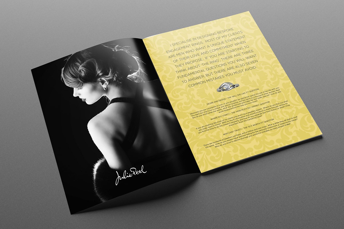
When it comes to digital printing for business, some of the most common things that come to our mind is a flyer, business card, banners, letterhead, logo, etc. Of all, a flyer is considered to be the most cost effective and cheerful way to create brand awareness among people.
Flyers prove to be an effective way to promote a product, and services, of a newly launched business in an area or special advertising events to customers. To help it accomplish the goal in the desired way it is important to avoid common mistakes that people make while creating it. There are some useful tips, implementing which can help in better publicity of your business.
Filling it with excess information
Some people try to use the space in the Flaierid or flyers to the maximum possible extent. This makes it less appealing and also creates disinterest in the reader. This strategy does not help you accomplish your purpose behind the creation of your flyer.
So, the key is not to fill the entire space of it. Give it some room to breathe. Mention only important points in one liner in the flyer. A person who is interested in your product or service will contact you. That is when you can describe it in detail.
Long headline:
A headline is the first thing that catches the attention of the reader. It is the aspect that compels a reader to take an interest in it and read it. A short, catchy and crisp headline will immediately grab the attention of the customer and encourage them to know more.
A perfect headline should be concise with a minimum number of words. The maximum length of the headline can be two lines. For your peace of mind, you should show a sample of your flyer to your colleagues before sending it out for printing.
Poor quality images
This is a very common mistake that negatively impacts the business. Use of low quality and blurred images will instantly put your brand image down in the eyes of the people. They will not pay attention to it and will also not be motivated to read it. To create the right impact on the people, it is important to pay attention to the quality of your flyer.
People are more driven by images than to text so choose high quality and sharp images in your flyer. You will get some high-quality stock images on the web about your product/service, or you can even click some from your smartphone and use them. A superior quality image will help your flyer stand out and get the best response from people.
Everyone wants to make a flyer as impressive and engaging as it can be. A flyer, when created properly, can bring you new customers. It is very important to know the right strategies to make it. Learning from these mistakes and employing right strategies would surely help you come up with an impactful creation next time.
Author’s Bio:
Frank Spark has written this article. PR-Disain is a leading digital printing company that offers exemplary services in design, image processing, scanning, and pre-press to its customers. They have accrued great experience in designing professional and impressive flyers on Flaierid for different types of businesses.


Comments