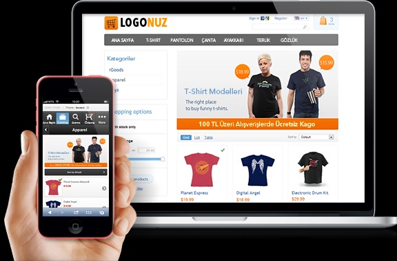
Are you in the process of setting up an eCommerce website? The real challenge starts after you’ve registered a domain and set up your web hosting. There’s the technical issues of setting up the site and of course, the design of your website. Coming up with the right look for your eCommerce site can be difficult because there not much room to work with. Most eCommerce site owners also feel limited because their site needs to perform in addition to having a great design. To help inspire ideas for your new site design, here are 15 examples to study.
1. https://us.tryvertty.com
Vertty is a company offering beachwear and other accessories. Instead of going with the traditional layout where products listing are laid out in one row after another, Vertty uses a varied layout to make their product presentation more interesting. They also add cool mouseover effects and animated images to help users understand their products better.
2. Fred Jourdain
Fred Jourdain is an artist that sells prints of his work through his eCommerce store. Instead of doing too much with the design, the layout is kept fairly simple to let the art shine. The layout of the product page works incredibly well. All the different photos of the print are clickable on the left hand side so that the art is centered and focused for the user to see.
3. Cienne
Cienne is a line of women’s clothing that’s been featured in some of the most well known magazines from W, Vogue, Bazaar, to Elle. To make use of all these features, they integrate brand logos of the magazine and include testimonials from the editors of these magazines. For their product category pages, they keep a minimalist look and use mouseover effects to show showcase their products in different angles.
4. Wrightwood Furniture
Wrightwood is more of the traditional eCommerce store. They use a massive amount of white space and make sure there’s adequate space between each web element to create an open and free look. The navigation is very well done. They use a combination of thumbnail images to pair the links, aligned links for the category pages and really quick loading drop downs that transition quickly.
5. Kutoa
Kutoa is a perfect example of brand storytelling done right. They have a small line of products they sell so they keep it simple on their product pages. They use their main page to sell the unique strengths of their product (gluten free, non GMO, no preservatives) and the mission behind their brand. This helps differentiate themselves from their competitors and really ties everything together.
6. B&O Play
B&O Play has a beautiful minimalist site that focuses on great photography and lots of white space. The layout is varied but the clean grid layout keeps it in check. The result is a soft look that resembles something between a home shopping site and a tech site. They also manage to integrate Instagram posts and various content on the bottom half of their page with great success.
7. Helbak
Helbak uses a very glossy, bright and vibrant design for their site. The look mostly comes from great photography done with a high quality camera and under precise lighting. A lot of beautiful pastels are used in the background for the featured products. They also have many of their products set in white so that it blends in with the site background and creates a more realistic look.
8. Dodocase
There isn’t anything quite eye-catching about Dodocase’s eCommerce site. In fact, the background color makes the website look dated. But what they really do well is how they present their products in many different ways through the main page. As you browse, you’re shown their products in use, the products displayed in different angles and their various product lines featured in unique ways so that you eventually click on something you like.
9. Tessemae’s
Tessemae’s uses a gigantic hero image of their products to make a big impact. They follow up with strong content box image links that lead the user to their different products. Each one is set in a different pastel color to create contrast and highlight the uniqueness of each product. The entire site is focused on making a big impact with the photos and images.
10. Grovemade
Grovemade’s site is all about creating a sleek and clean look. This look helps their products stand out which is made of wood carved office accessories. The product pages all use a big photo which is followed by lengthy content about the product. This is then followed by image slideshows of the product. Many online stores are afraid of not condensing all the information in one page but Grovemade has no problem using two to three pages to showcase their product.
11. Norwegian Rain
Everything about Norwegian Rain’s online store oozes high fashion and quality craftsmanship. They use high quality photos for their hero images which rotate on a slider. Things really get interesting when you click on a product page. It starts off with the hero image slider for the product followed by a product description. Below the description, you get an explanation of the craftsmanship behind each of their coats with different consumer guides like sizing, material and the technology.
12. Best Made Co
Best Made Co sells many different types of products. Instead of displaying them normally, they use a side scroll slideshow that can be browsed with the mouse scroll. It catches you by surprise because as you start going down the main page, it stops at a certain point and the site scrolls through various products. The product pages display a unique story behind each product and all the other small details that buyers would want to know.
13. Pure Cycles
Pure Cycles uses big picturesque photos for their hero image. They use unique font to accompany these pages, almost making it look like a well-edited Instagram post. Their navigation features small thumbnail images of their different bike models. Their accessory category page offers many search filters from colors, styles, model-specific add-ons, and more.
14. Bottle Cutting
Bottle Cutting is a company that sells a bottle cutting kit for alcohol and other glass bottles. They use a beautiful vintage style animation to present their product and integrate Instagram posts of customers that have created their own glasses using their product. This is a brilliant way to add a customer testimonial for their product.
15. The Practical Man
The Practical Man uses one of the most interesting layouts you’ll ever come across. It separates the layout elements by bold blocks almost reminding you of Lego blocks. They also place elements on areas of the site you wouldn’t expect. For example, a promotional offer is placed at the very top of the site. A recently purchased widget is placed next to the header graphic. A search box is featured in the center right below the header.
As you can see, you don’t have to limit the design of your eCommerce website. There are numerous ways to design your site. So before you finish setting up your web hosting and look for a generic theme/template, use ideas from the sites presented in this article to create something that’s unique to your website.






Comments